Our Fundi Branding


Our Fundi Branding
Professional repair services providers qualified handymen.
Case Study: OurFundi Brand Identity
Executive Summary
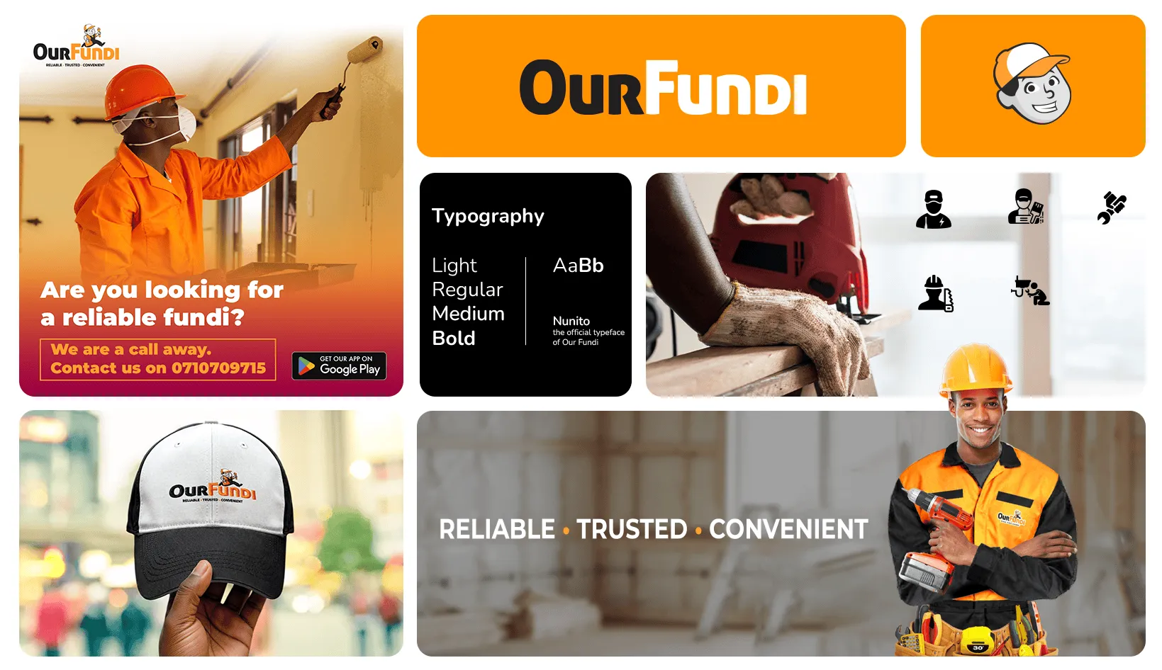
OurFundi is an on-demand digital platform connecting users with verified local artisans (“fundis”) and handymen. Built on three core pillars—Reliable • Trusted • Convenient—the identity bridges the gap between informal service sectors and a modern, professional, tech-driven customer experience.
Visual Anatomy
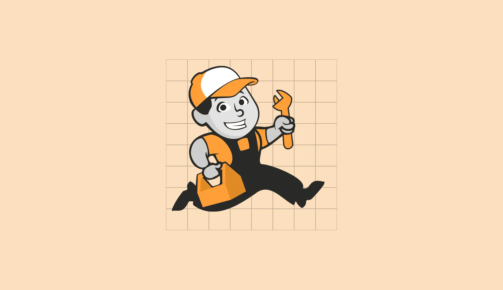
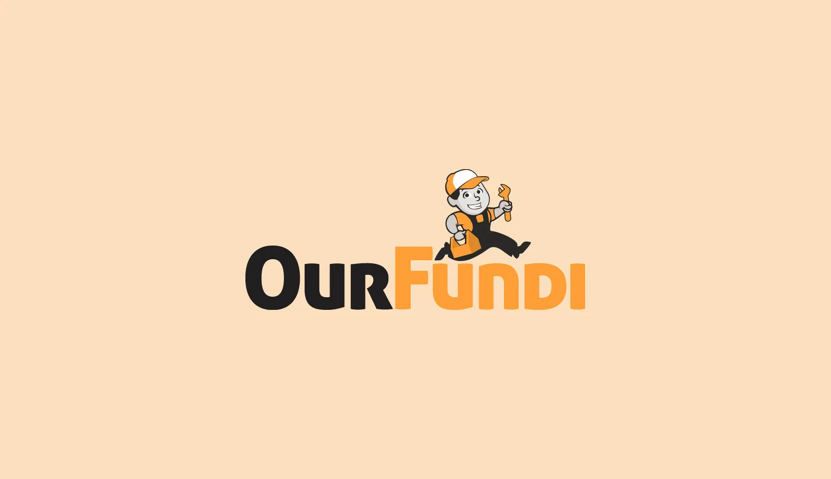
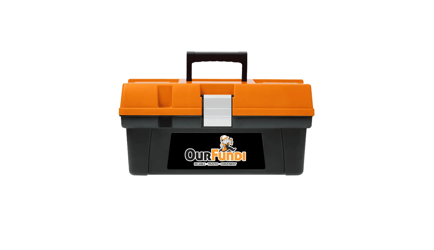
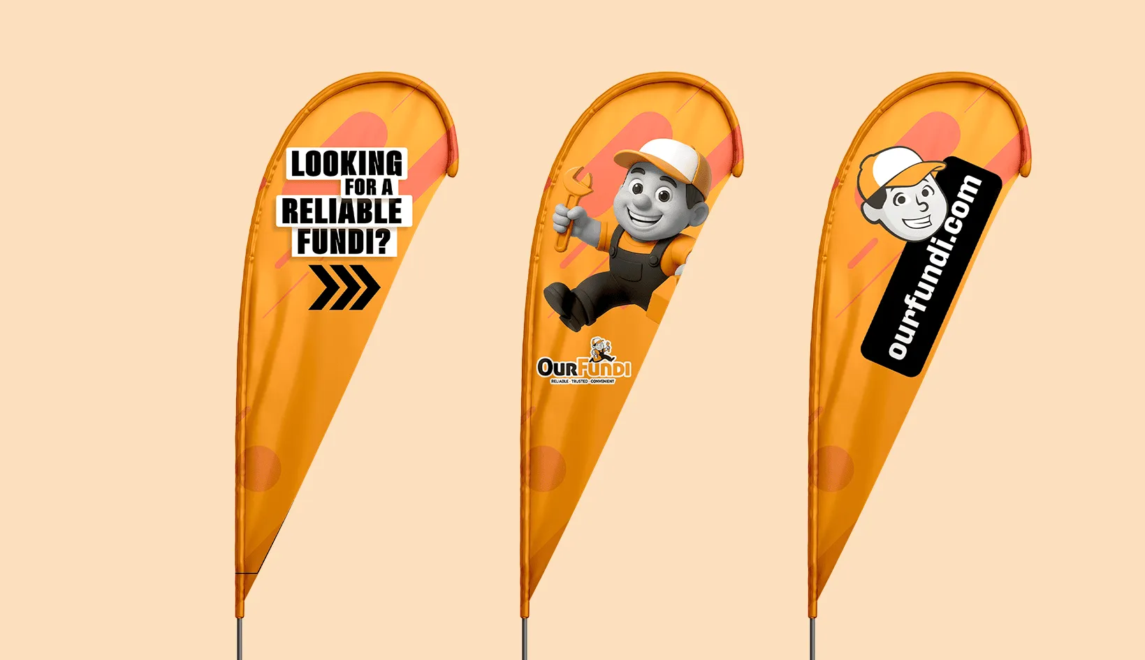
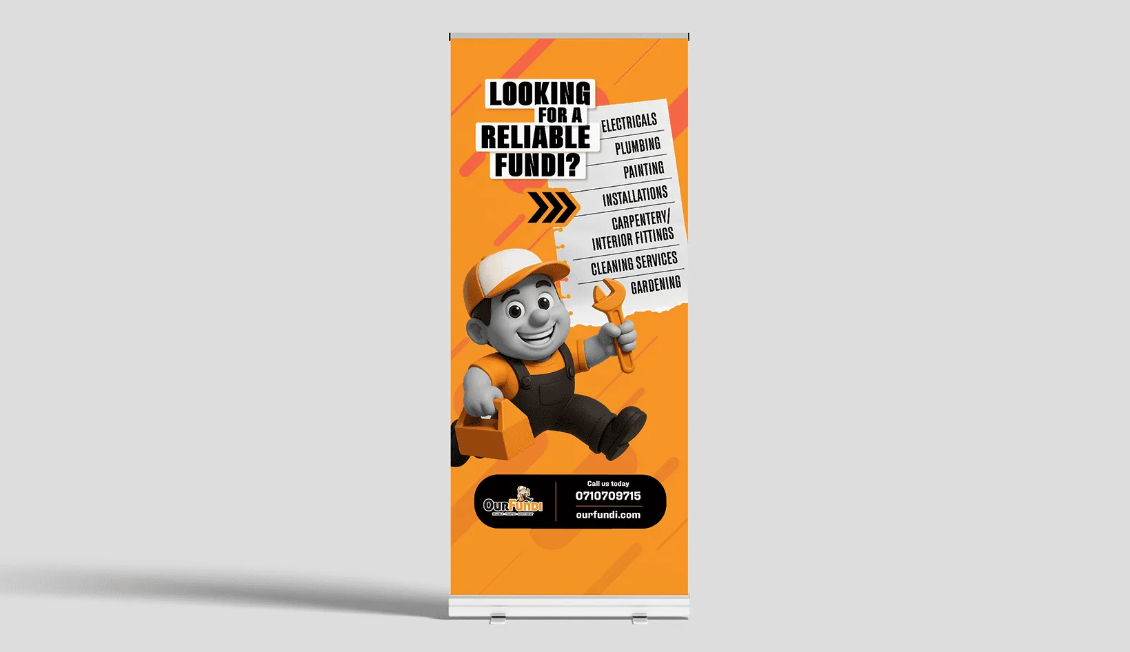
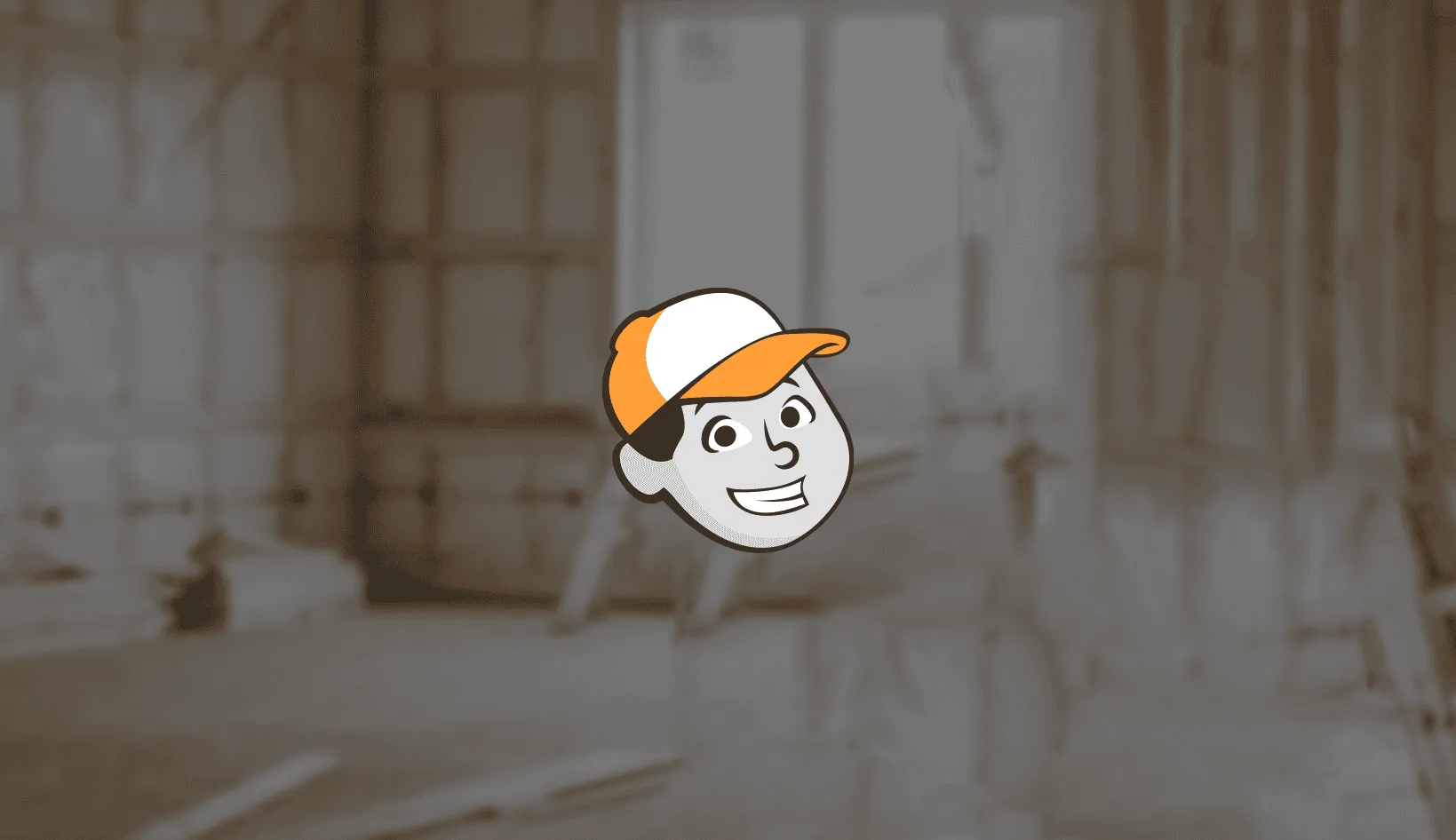
- The “Fundi” Hero Mascot: A dynamic, smiling artisan character captured mid-stride with a wrench and toolbox. The motion implies rapid response, while the cheerful smile builds immediate trust and approachability.
- Typography: Bold, heavy-weight sans-serif lettering. “Our” in stable charcoal establishes corporate reliability; “Fundi” in vibrant safety orange highlights local expertise and energetic craftsmanship.
- Color Psychology:
- 🟠 Safety Orange: Action, energy, productivity, and high field visibility.
- ⚫ Charcoal Black: Authority, professional excellence, and structural stability.
Application & Touchpoints
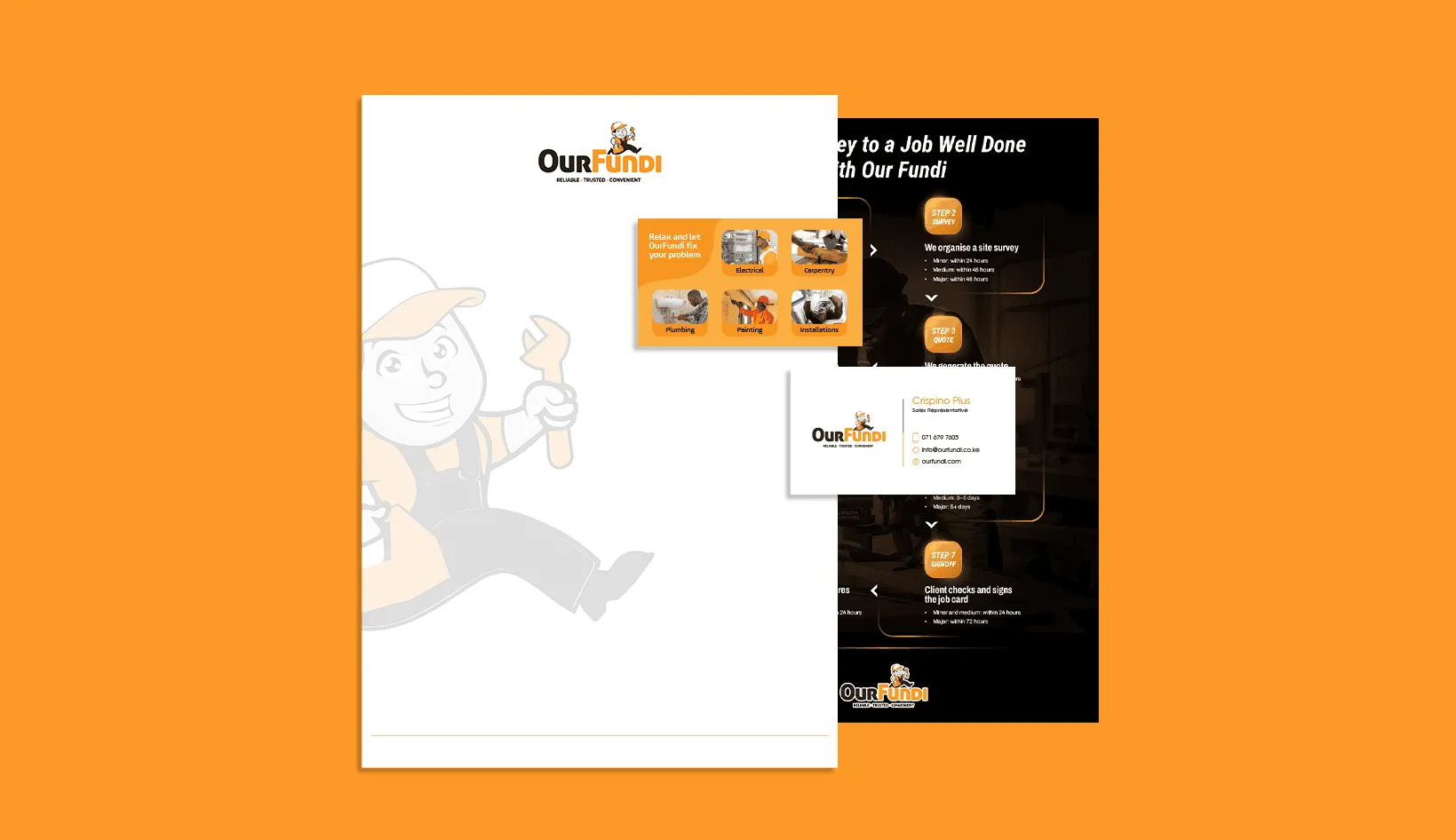
Designed for versatility, the visual system scales seamlessly from pixel to print:
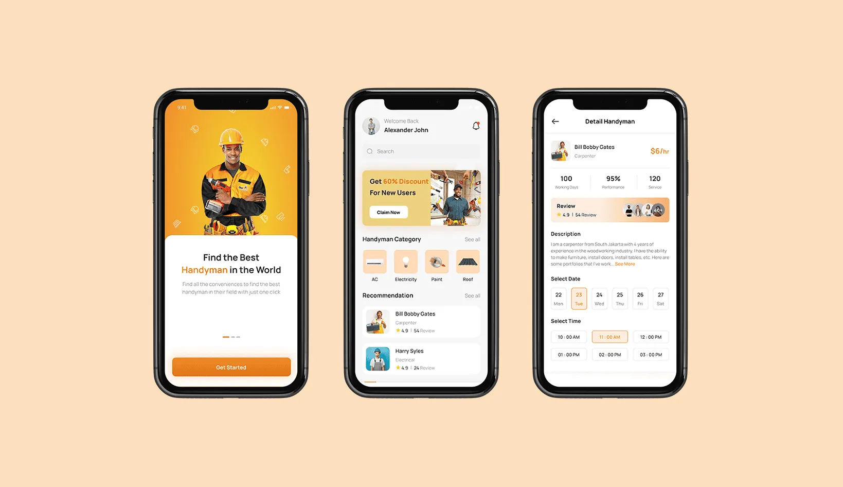
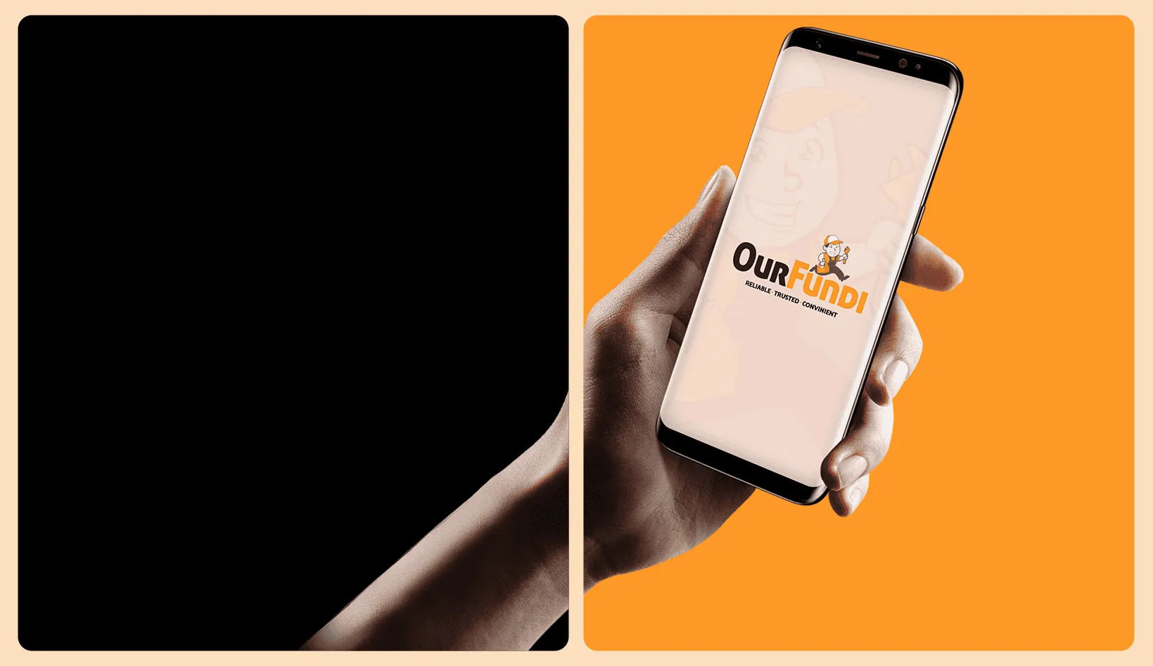
- Digital Interface: High-impact, recognizable app icon and digital brand asset.
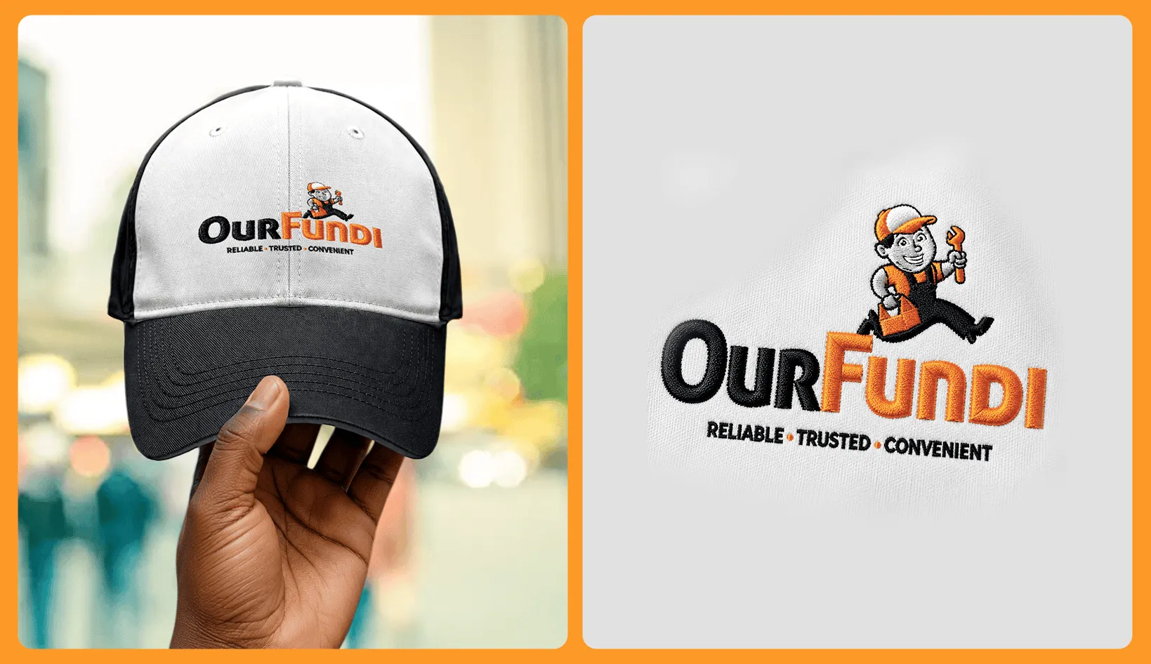
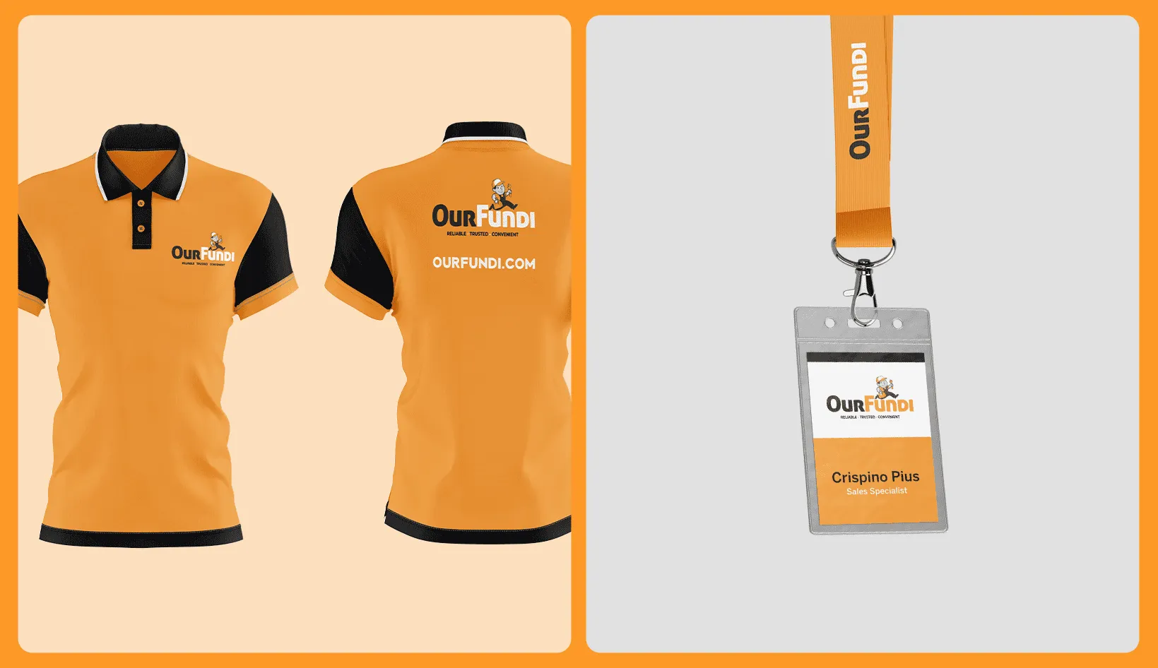
- Field Uniforms: Highly visible, professional apparel that instills consumer confidence.
- Fleet Graphics: Kinetic vehicle wraps leveraging the mascot’s directional forward movement.