Siri Zuri Branding
Siri Zuri Branding
AFD implements France’s policy on international development and solidarity. Through its financing of NGOs and the public sector, as well as its research and publications, AFD supports and accelerates transitions towards a fairer, more resilient world.
Case Study: Siri Zuri Brand Identity
Executive Summary
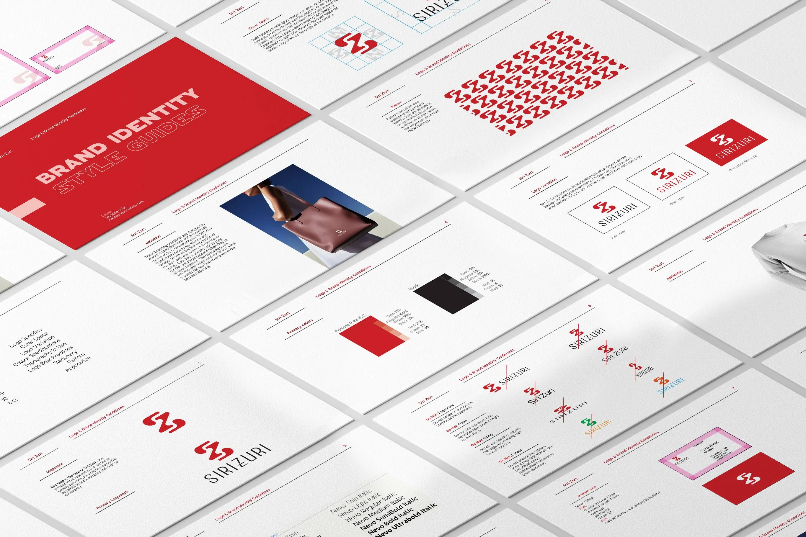
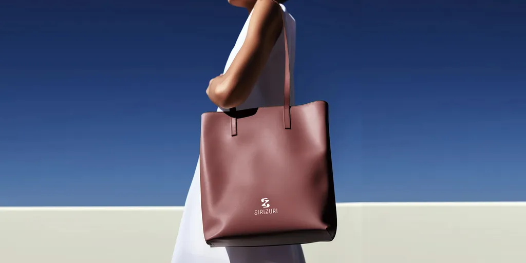
Siri Zuri (designed by Senzafine) is an elegant, high-end lifestyle or beauty brand rooted in excellence and pristine first impressions. Built on sophistication and structural consistency, the visual identity blends clean geometry with editorial luxury to communicate premium quality across both digital and tactile mediums.
Visual Anatomy
- The Logomark: A refined corporate expression anchoring the face of the brand. Built on strict clearance rules—measured by $50%$ height structural padding dictated by the primary capital “S”—ensuring absolute legibility and breathing room.
- Typography (The Nevo Family): * Nevo Font: Utilized as the primary anchor for titles, body copy, and editorial correspondence.
- Pairing Strategy: Paired explicitly with contrasting high-end serif fonts to establish multi-level reading hierarchies without restricting creative expression.
- Color Psychology:
- 🔴 Crimson Red (Pantone P 48-16 C): Evokes passion, luxury, vitality, and distinct confidence. Used on primary layouts and standalone logomarks.
- ⚫ Absolute Black: Represents timeless sophistication, high-end fashion alignment, and structural ground.
- ⚪ Pure White: Applied as a canvas choice to enhance negative space and optimize editorial layout clarity.
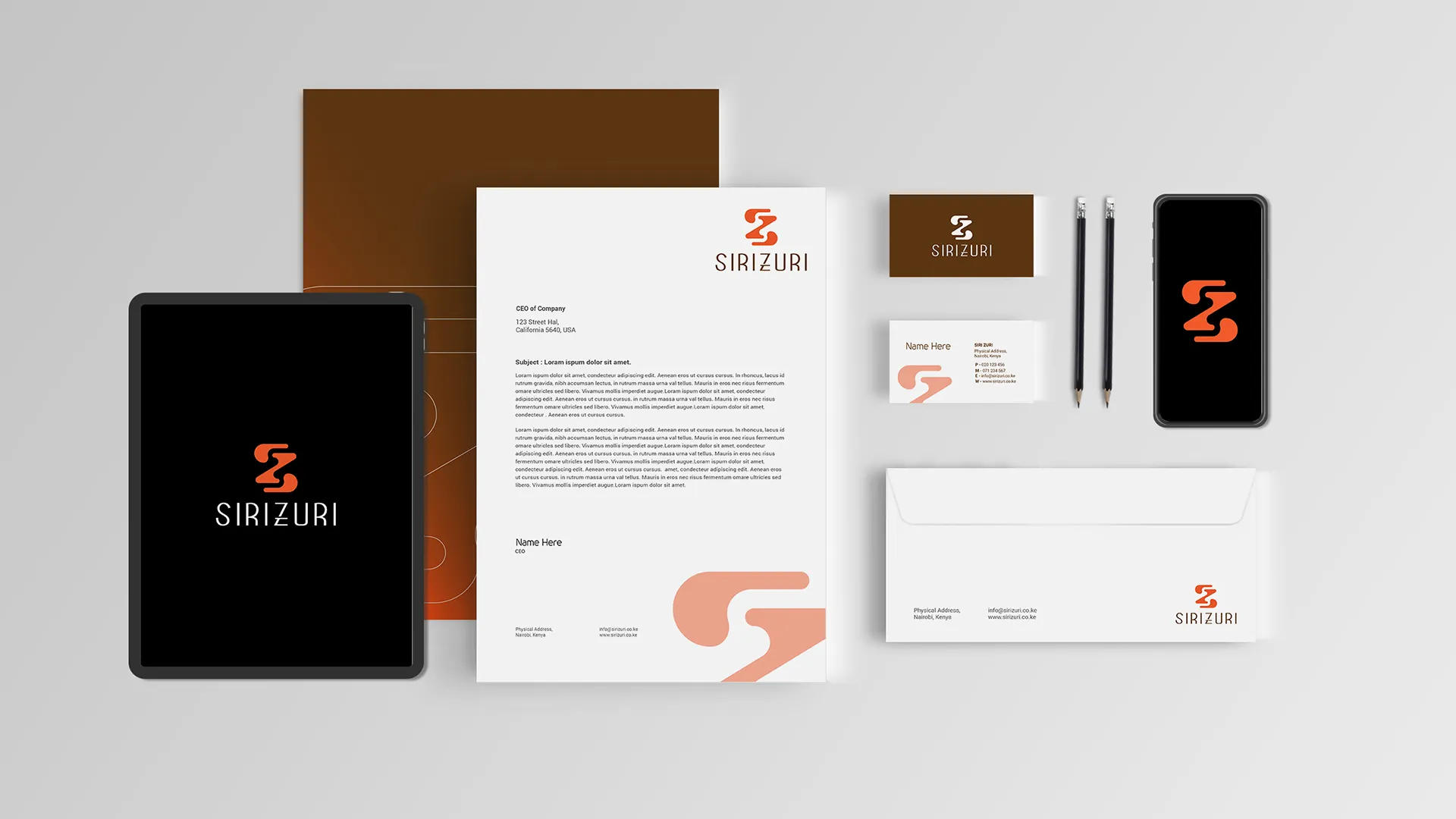
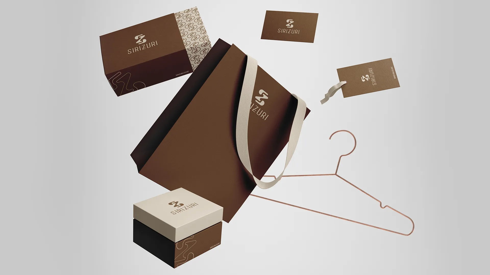
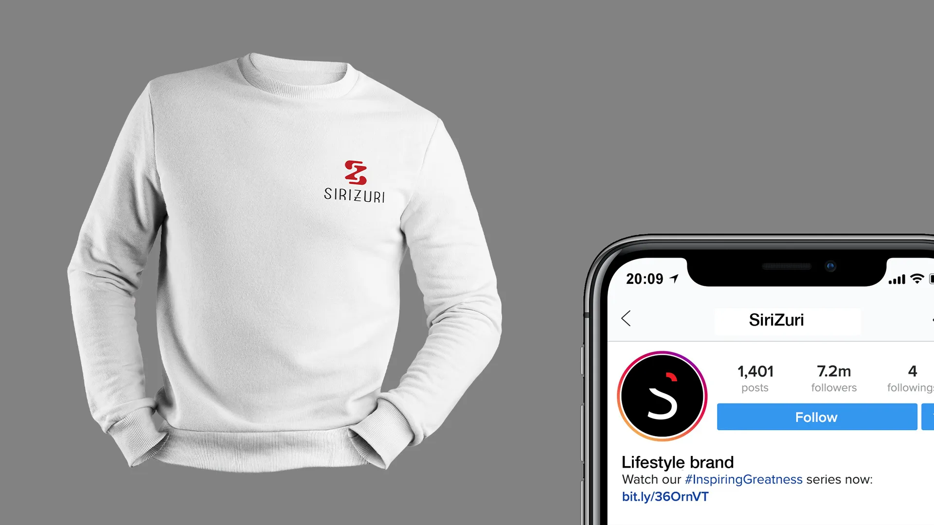
Application & Touchpoints